|
A way of representing activities and dependencies involved in a complex project. There are several versions of Activity Network Diagram, the main types being PERT and CPM.
| Box Plots (Box and Whisker Plots) |
|
Box Plots are used to represent relatively small data sets. The standard format of a box is shown below:
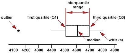
The outliers are points that are more than 1.5 times the interquartile range above the third quartile or below the first quartile. The whiskers extend to the largest, and smallest, data values that are not outliers.
A tally sheet that is used to collect data . It is a simple method that can be used with a minimum of instruction:
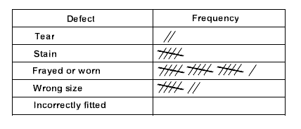
A Pareto Chart would often be a useful next step for analyzing the results.
| Consensus Criteria Method |
|
See Prioritization Matrices
Critical Path Method. Essentially the same as PERT, although there are some technical differences.
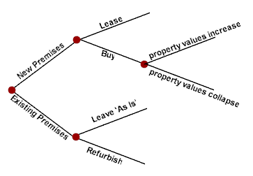
A graphical tool for helping to chose between several courses of action. The tree starts with the decision that has to be made. The branches are then formed from the future decisions that the initial decision will leads to, or to the possible outcomes from the decisions:
A diagram, or table, that shows the number of observations falling into each of several ranges of values. A histogram is a common method for representing a frequency distribution.
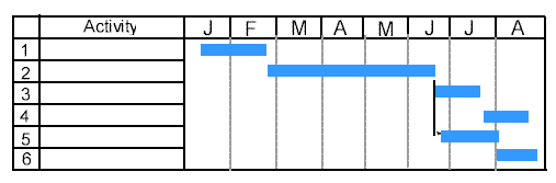
A chart showing the work breakdown against time. The vertical axis shows the activities and the horizontal axis the time (in days, weeks, months etc.)
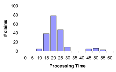
A graphical method that represents the distribution of values in a data set. The data values are grouped into ranges and shown as bars on a histogram:
See QFD
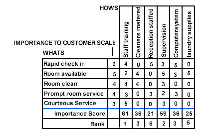
A diagram used to analyze the associations between two groups of ideas. It is a simplified version of Quality Function Deployment (QFD):
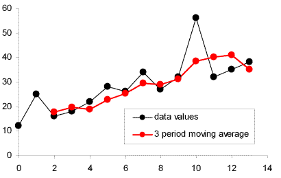
A method for removing the turbulence from data to better reveal underlying trends. Each point is the average of 'n' consecutive periods.
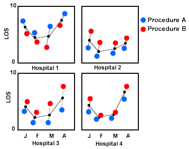
Charts that show patterns of variation from several possible causes. The example shows a comparison of LOS (Average Length of Stay) for two procedures at four hospitals over a four month period:
A type of ordered histogram often used to evaluate the frequency of occurrence of defects. It is called a Pareto Chart because the distribution of defects typically obeys the Pareto Principle, 20% of the defect categories account for 80% of the defects.
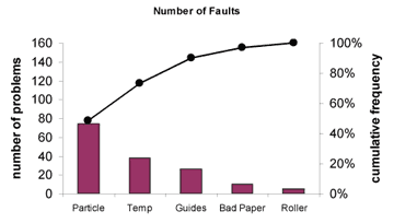
It is usual to include the grouped results in the bars, and a line graph of the cumulative total.
The Pareto principle was originated by an Italian economist, Vilfredo Pareto, who found that 20% of the population owned 80% of the resources. This principle applies to many phenomena, in process improvement it is often found that 80% of problems will result from 20% of the causes. Sometimes expressed as The vital few and the trivial many.
The shape of the graph is recursive; once the major source of defects has been removed the principle still holds.
Program Evaluation and Review Technique. A graphical method (often computerized) for managing large projects:
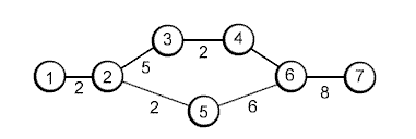
The lines represent activities, the numbers on the lines are durations and the nodes (circles) represent milestones,
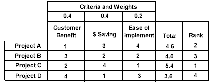
These are used to help prioritize decisions. There are several forms, the one illustrated is the Consensus Criteria Method:
Quality Function Deployment is a method used to relate the characteristics that customers value to the specific features and specifications of the product. QFD is similar to the Matrix Diagram, but contains more features:
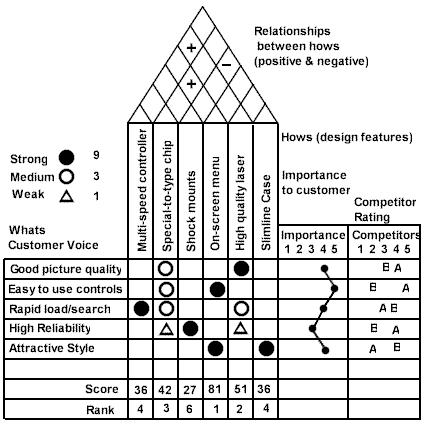
The QFD diagram is often called the 'house of quality' from its appearance.
| Quality Function Deployment |
|
See QFD
A chart that plots values in time order:
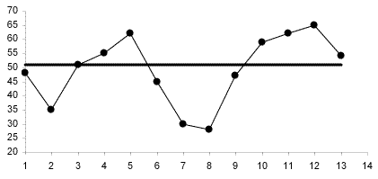
The center line is the median value. A run is defined as one or more consecutive points on the same side of the median. The runs are analyzed, patterns that indicate a 'special cause' are:
- the presence of too few, or too many, runs for the number of points
- too many data points in a run
- an unusually long sequence of ascending or descending data points
- too many points forming a zigzag pattern
A stem and leaf plot is similar to a histogram, but uses the decimal places to build up the bars. The advantage of this is that the plot contains all of the original data.
The dataset:
1.0, 1.1, 1.5. 1.7, 1.9, 2.4, 2.5, 2.5, 2.5, 2.6, 2.8, 2.9, 3.0, 3.3, 3.5, 3.8
can be represented by:
|
Stem
|
Leaves
|
|
1
|
0
|
1
|
5
|
7
|
9
|
|
|
|
2
|
4
|
5
|
5
|
5
|
6
|
8
|
9
|
|
3
|
0
|
3
|
5
|
8
|
|
|
|
The scheme can be modified to suit the spread of the data values. For example, the stem could be increased in increments of 0.5, rather than integers.
A variation of the moving average where the 'n' periods are given different weights, the purpose being to put more weight on the most recent period.
|


